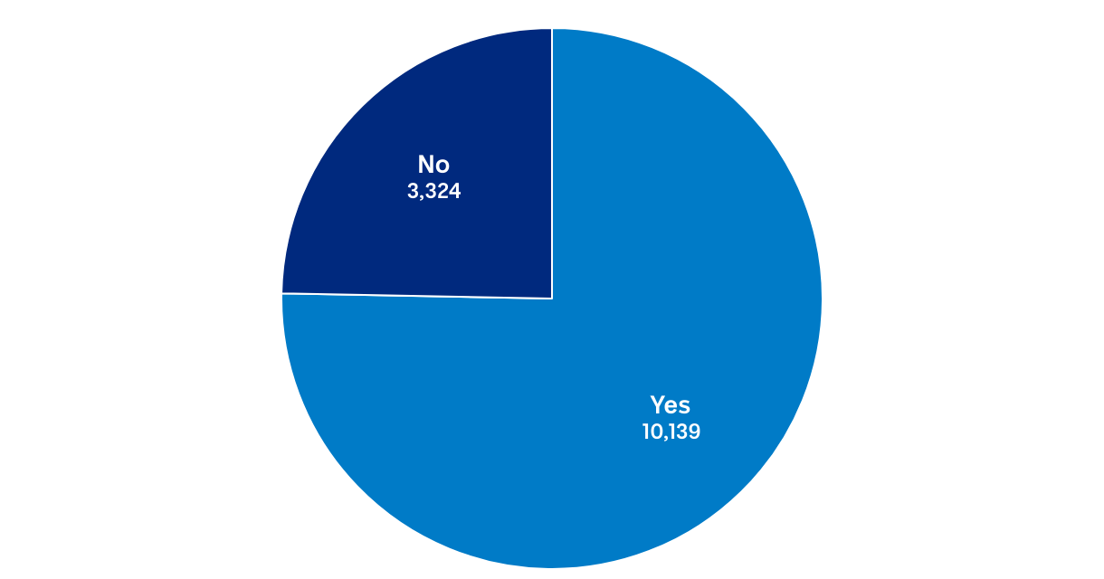
Do you have your own account?
A pie graph showing a larger portion in lighter blue for yes and a smaller portion in dark blue for no.
(Please use a modern browser to see the interactive version of this visualization)