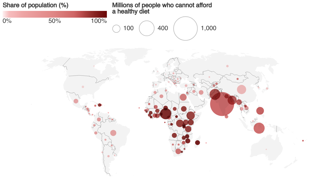
Over 3 billion people - 42% of the global population - could not afford a healthy diet in 2021
Population who cannot afford a healthy diet, 2021
A world map showing the number of people unable to afford a healthy diet by size of bubble for each country, and the percentage of each country's population affected, shown by shade of color.