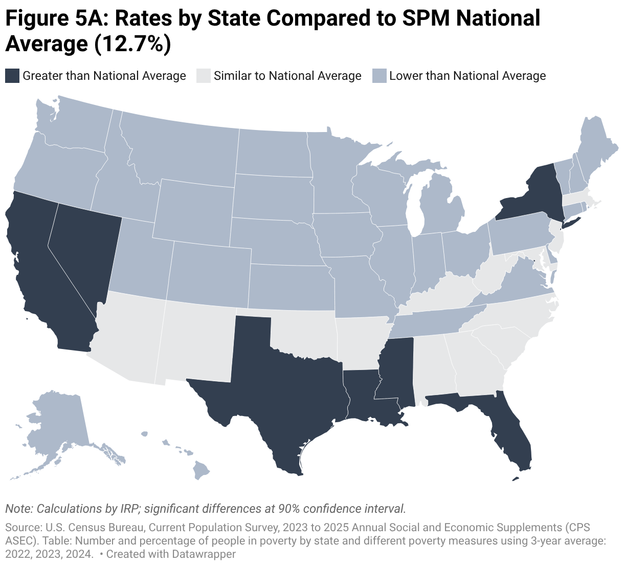
Figure 5A: Rates by State Compared to SPM National Average (12.7%)
Map of the United States with states color coded by whether they are above, below, or statistically similar to the national poverty rate using the Supplemental Poverty Measure.
(Please use a modern browser to see the interactive version of this visualization)
