Ontario Driving vs Transit Commuters Per Cent Over Time
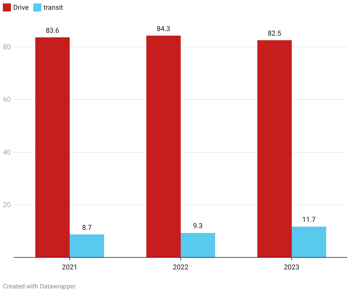
This chart shows the percentages of total commuters in Ontario for 2012, 2022, and 2023 who drove versus taking public transportation.
This chart shows the percentages of total commuters in Ontario for 2012, 2022, and 2023 who drove versus taking public transportation.