State-Level Hotspots for Exclusions in the U.S.
This map shows the number of exclusions by state, highlighting areas with the highest concentrations. Darker colors represent more exclusions.
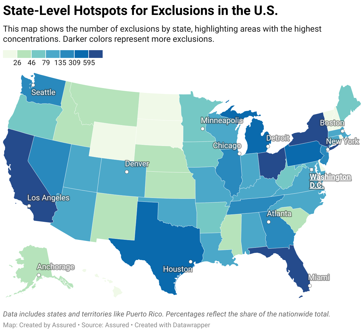
A choropleth map of the U.S. showing state-level exclusion counts. States with higher exclusions are shaded darker. California has the highest count at 930 exclusions (12.90%), followed by New York with 699 (9.69%), Florida with 600 (8.32%), Ohio with 595 (8.25%), and Texas with 429 (5.95%). Lighter shades indicate fewer exclusions, with some states like North Dakota having as few as 11 (0.15%).
