Breakdown of Leading Causes of Death in the U.S.
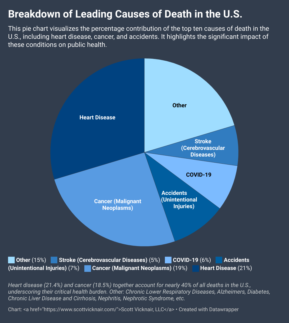
This pie chart visualizes the percentage contribution of the top ten causes of death in the U.S., including heart disease, cancer, and accidents. It highlights the significant impact of these conditions on public health.
