Spending Soars
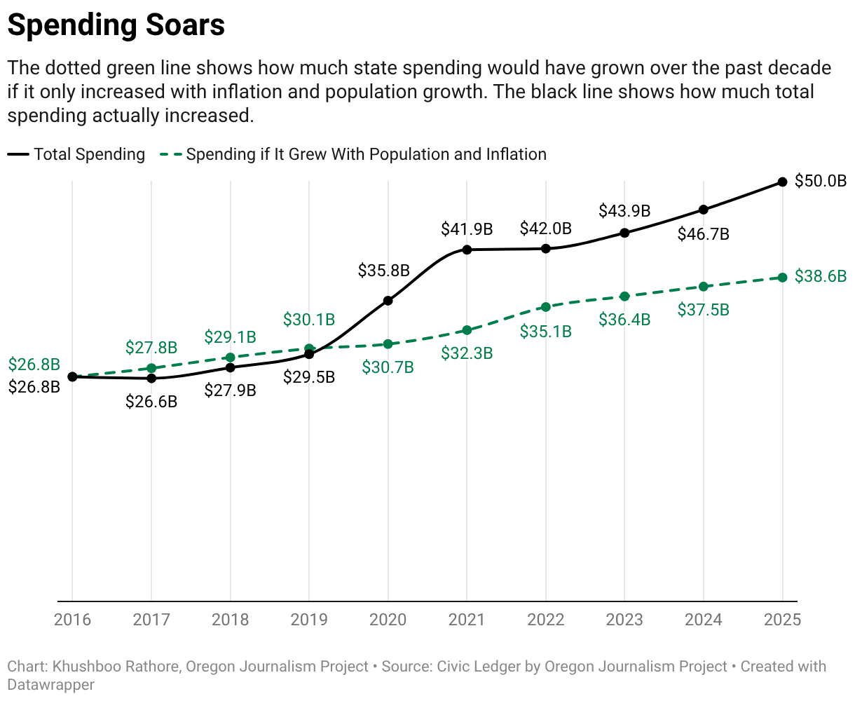
The dotted green line shows how much state spending would have grown over the past decade if it only increased with inflation and population growth. The black line shows how much total spending actually increased.
The dotted green line shows how much state spending would have grown over the past decade if it only increased with inflation and population growth. The black line shows how much total spending actually increased.