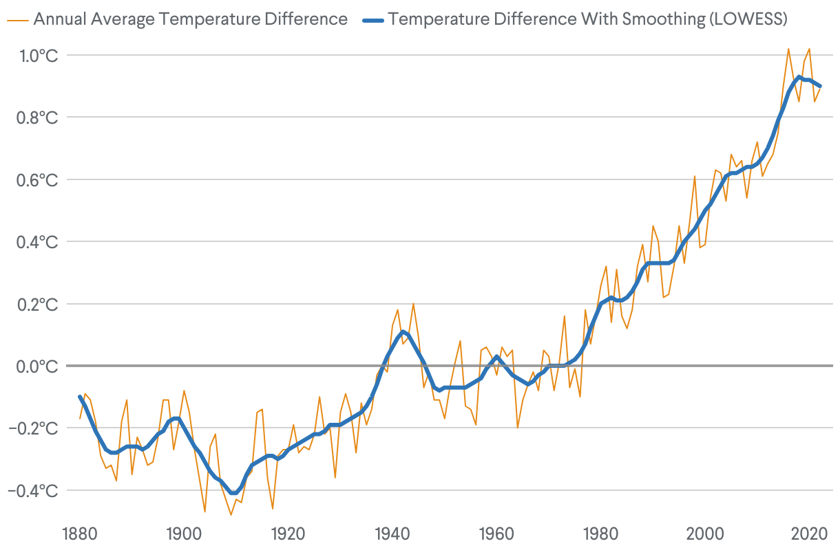
World Temperatures Rise Over Past Century
Change in global surface temperature compared to average, 1951 to 2022
This chart shows the change in global surface temperature compared to the average (from 1951 to 2022). It highlights how temperatures have risen over time relative to this baseline period, helping us understand trends in global warming.