Move distance increases with income
Average move distance (miles) by neighborhood per-capita income
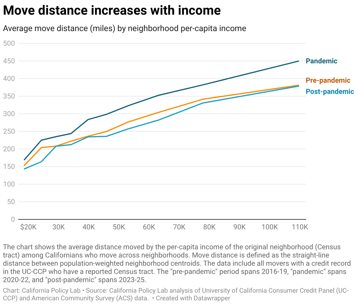
A line graph showing the average distance of a move (in miles) based on the per-capita income of the neighborhood the person is leaving. In all periods (pre-pandemic, pandemic, and post-pandemic), move distance increases as income increases. The pandemic period (dark blue line) shows significantly longer move distances across all income levels compared to pre- and post-pandemic trends.
