Contribution of Data by Country
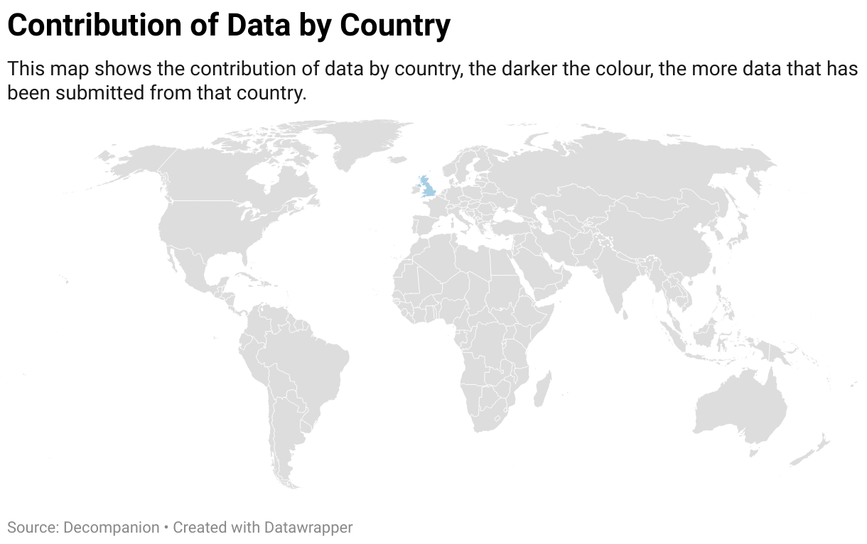
This map shows the contribution of data by country, the darker the colour, the more data that has been submitted from that country.
A map showing the contribution of data by country.
This map shows the contribution of data by country, the darker the colour, the more data that has been submitted from that country.
