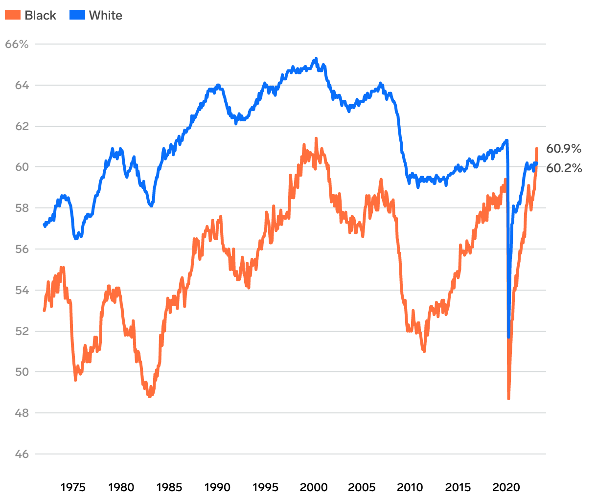
US employment-population ratio
Line chart comparing the Black and white employment-population ratios. The share of Black Americans with a job is higher than the share of white Americans for the first time since the Bureau of Labor Statistics started tracking Black employment-population ratio data in 1972.