Products' satisfaction gap
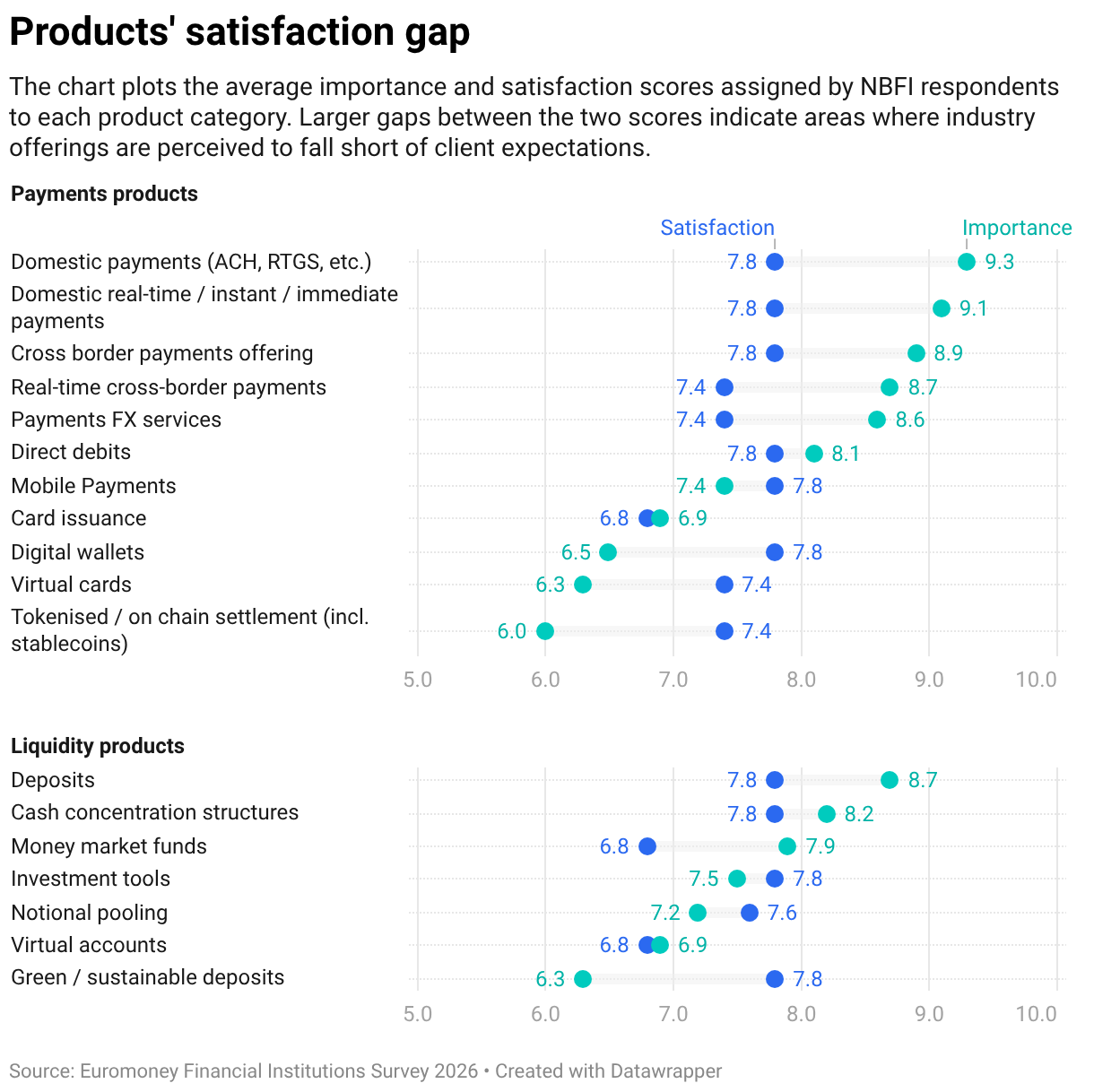
The chart plots the average importance and satisfaction scores assigned by NBFI respondents to each product category. Larger gaps between the two scores indicate areas where industry offerings are perceived to fall short of client expectations.