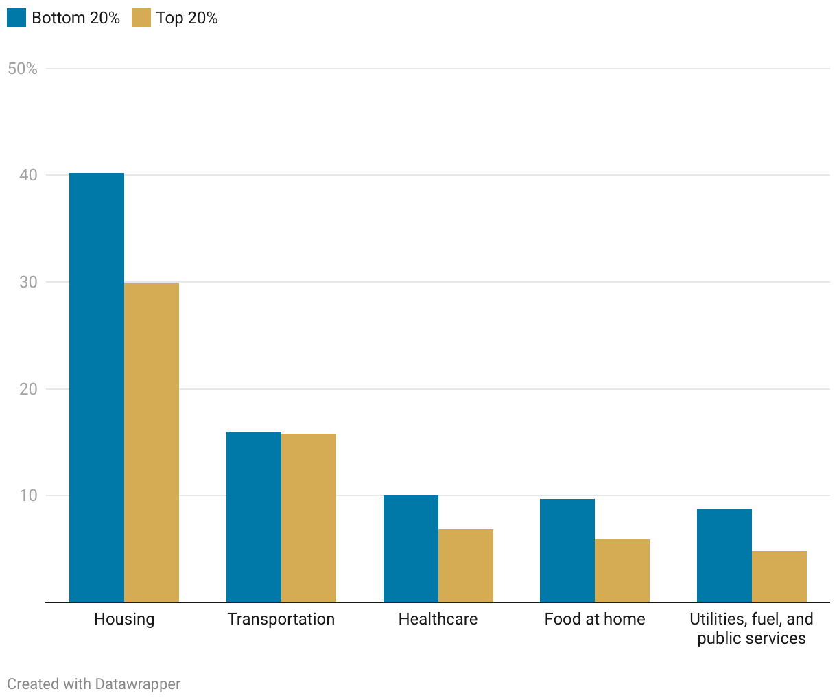
This bar chart shows the percent of total expenditures the bottom 20% and top 20% of Americans spend on the following categories: housing, transportation, healthcare, food and home, and utilities, fuel, and public services.
Comparing Expenditures of the Bottom and Top 20% of Americans
Category spending as a percentage of total expenditures