Population of the World Living in Countries Poorer Than Mexico Compared to US Population
This chart should make it blindingly obvious that the USA/West needs to implement an immigration cut off
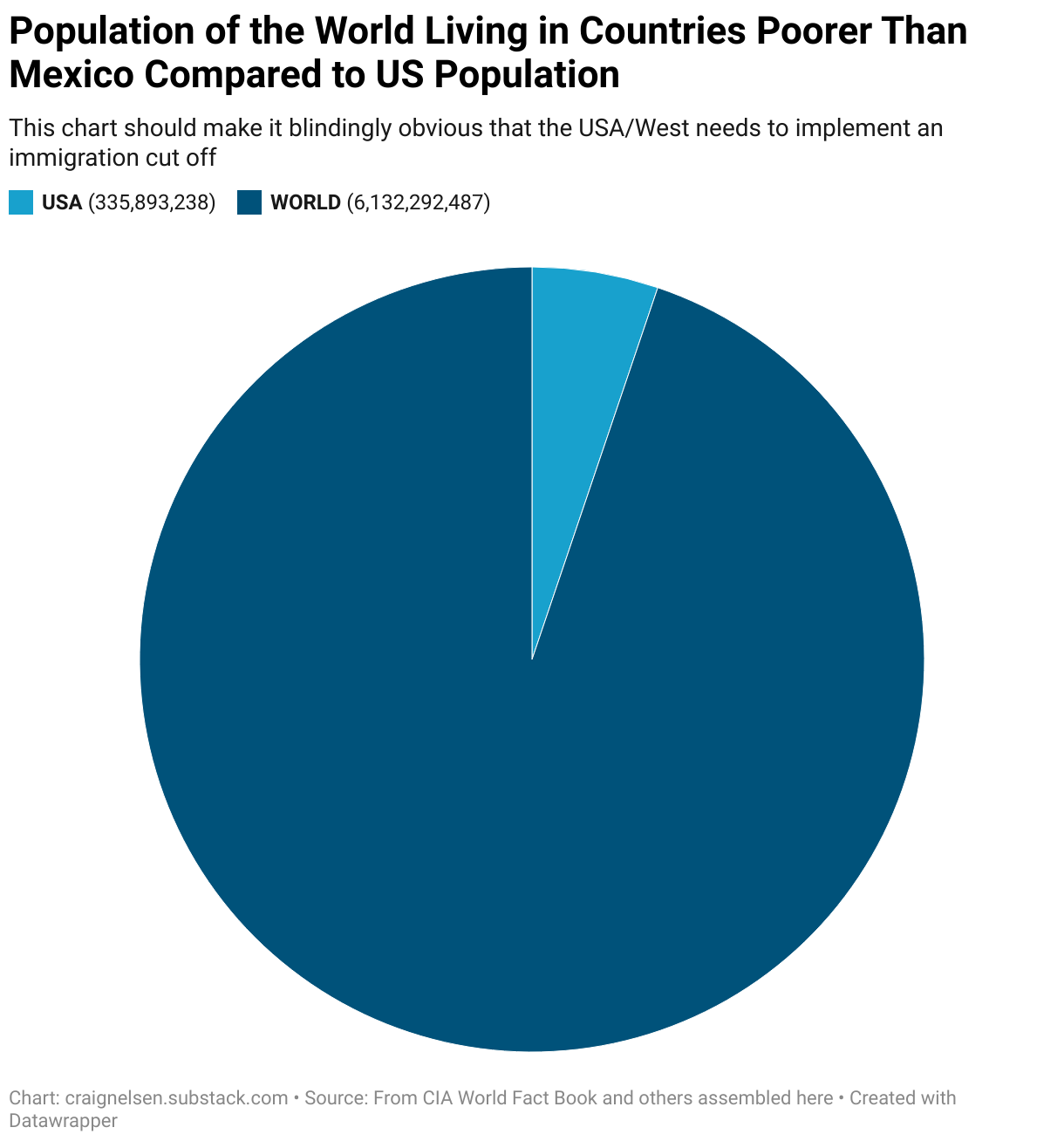
This is a pie chart comparing the size of the world population living in countries poorer than Mexico to the size of the US population (which is a slice of the pie with an arc of just 20 degrees of the 360 degree pie)
