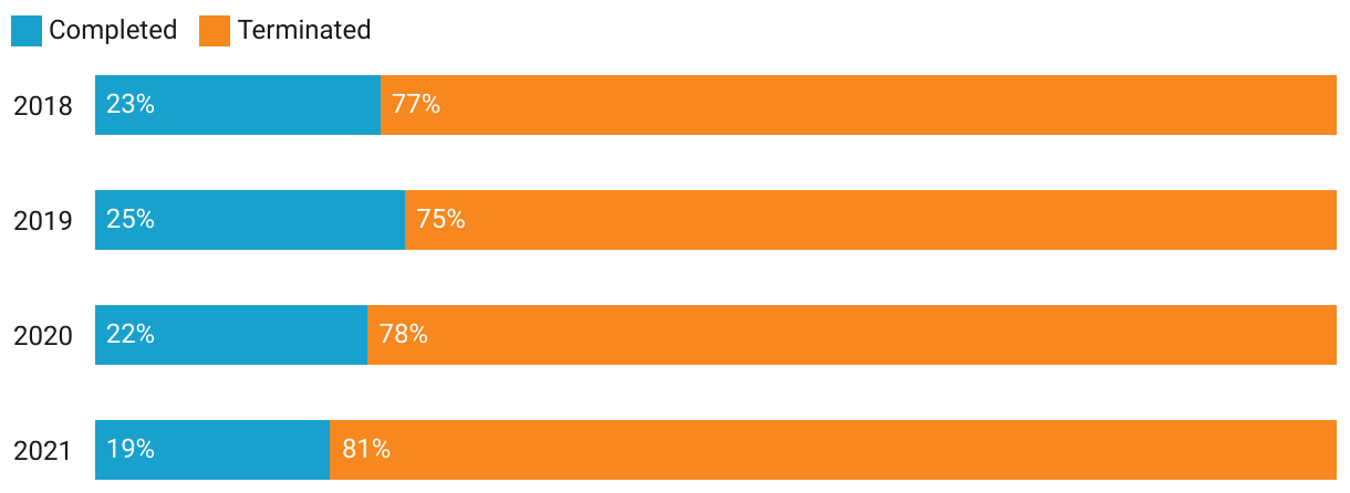
Electronic monitoring completion for people who are unhoused
This figure is two clustered horizontal bar graphs for the time period of 2018 to 2021.The first cluster shows the completion status by year for people who are housed and the second shows the completion status by year for those who are unhoused or unstably housed. The success rates are consistently higher across the years for people who are housed than those who are unhoused or unstably housed.