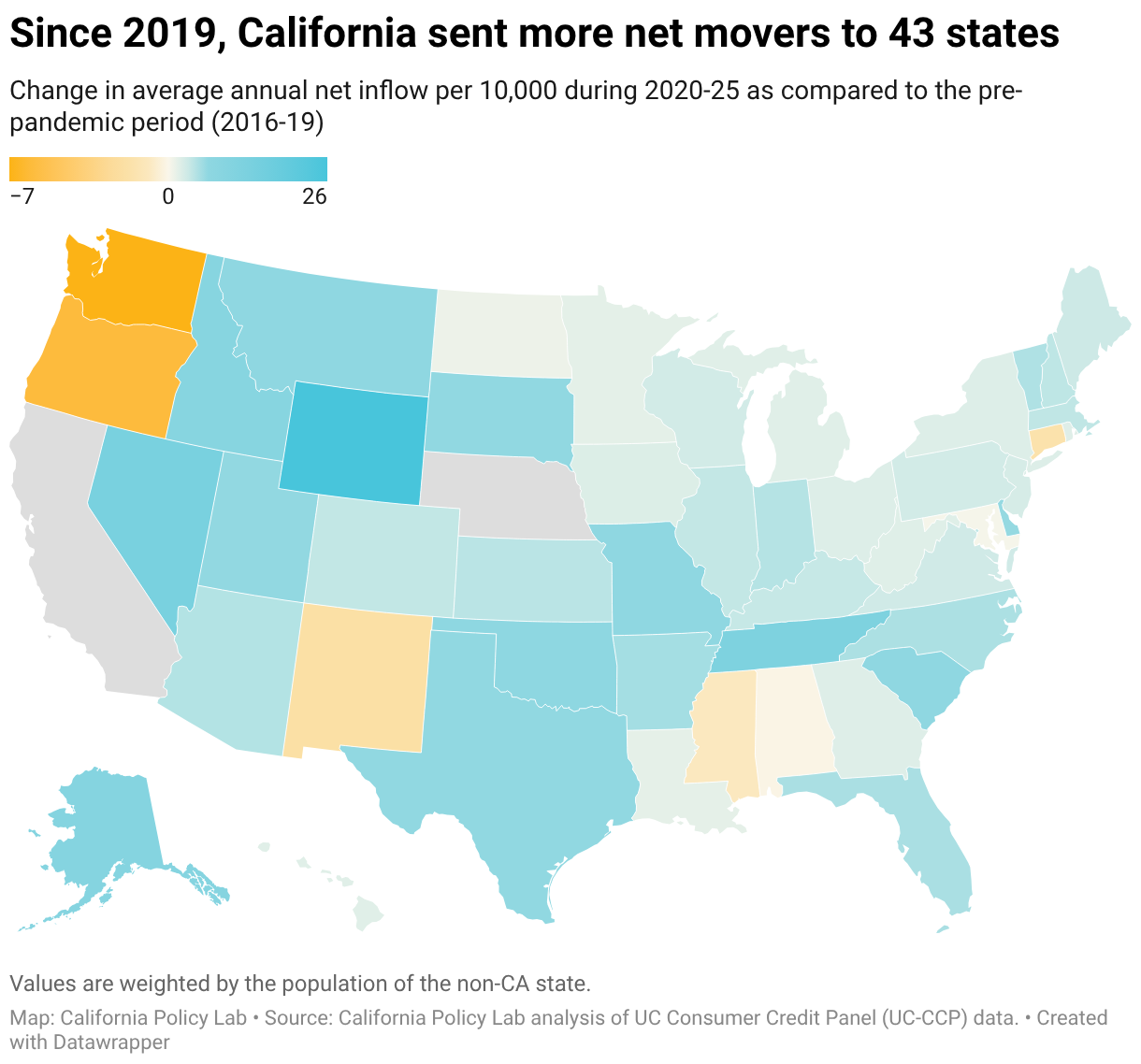
Since 2019, California sent more net movers to 43 states
Change in average annual net inflow per 10,000 during 2020-25 as compared to the pre-pandemic period (2016-19)
A choropleth map showing the change in average annual net inflow from California per 10,000 residents during 2020-25 compared to the pre-pandemic period. Most states are shaded light blue, indicating they are receiving more net movers from California than before. Washington and Oregon are shaded orange, indicating they are receiving fewer net movers per capita from California than they did pre-pandemic.
