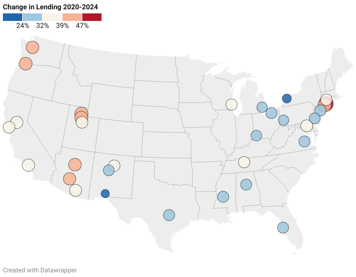
Metro Areas
The 32 metros included in this report represent the broad variation in housing markets and how shifting migration and demographics impact different parts of the United States.
The colors indicate the severity of the decline with red showing the metros that reported the most severe decrease.