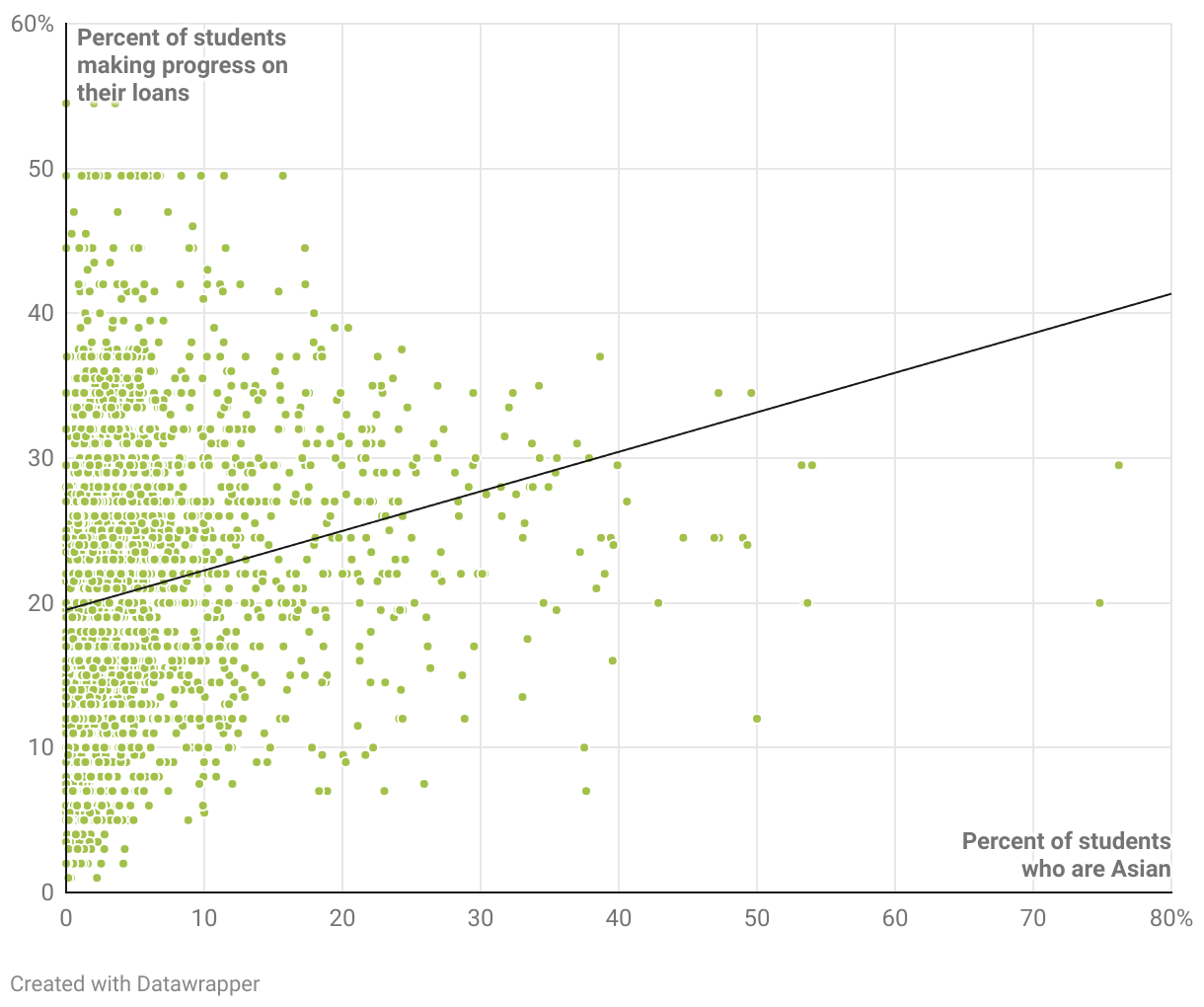
A scatter plot chart where every point on the chart is a school. The x-axis is percent of students who are Asian. The y-axis is the percent of students who are making progress on their loans. There is a correlation between these metrics. Schools with a higher share of Asian students have a higher percent of students who are making progress on their loans after three years.