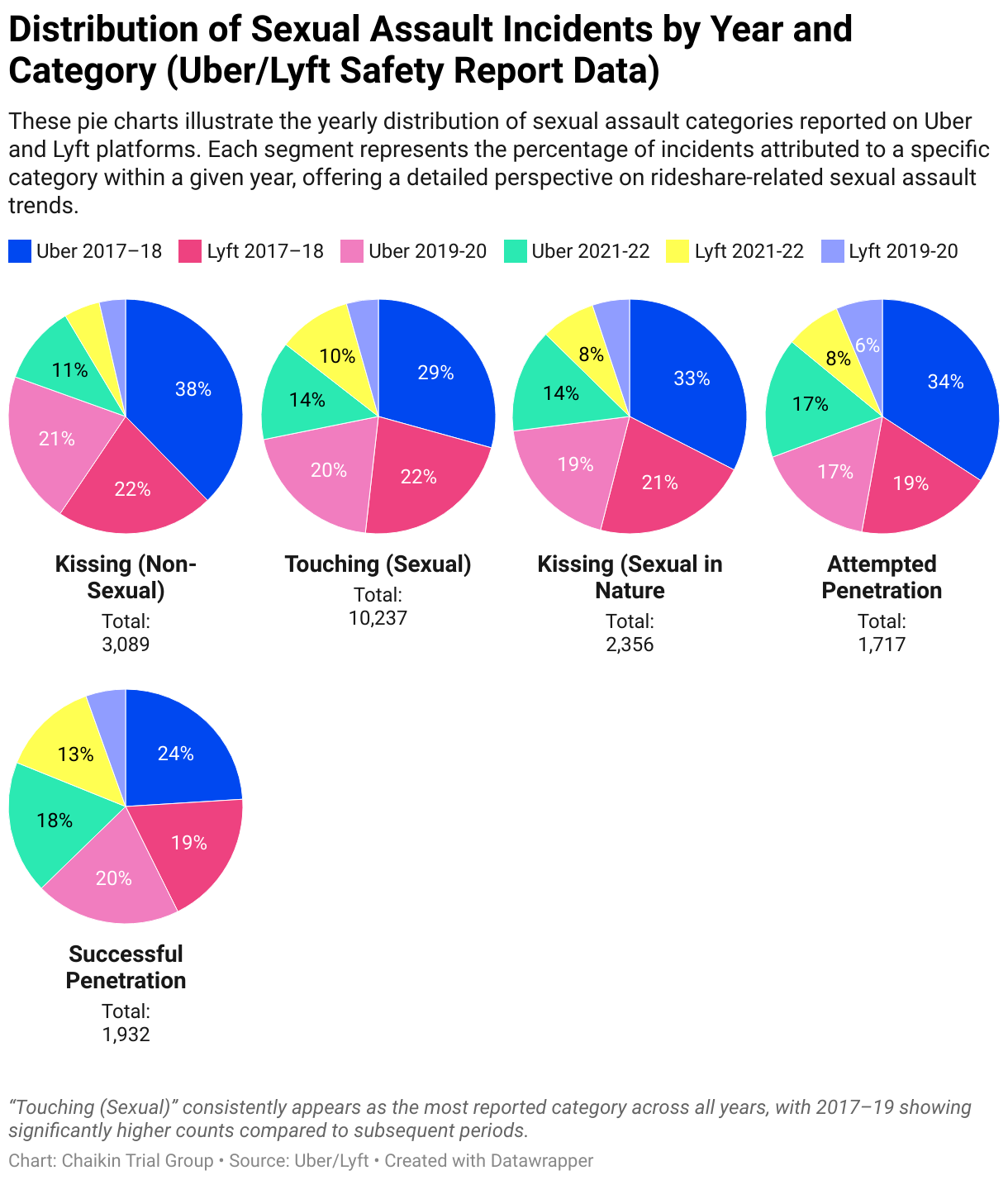
Distribution of Sexual Assault Incidents by Year and Category (Uber/Lyft Safety Report Data)
These pie charts illustrate the yearly distribution of sexual assault categories reported on Uber and Lyft platforms. Each segment represents the percentage of incidents attributed to a specific category within a given year, offering a detailed perspective on rideshare-related sexual assault trends.
