Travelers' PM2.5 Exposure vs Pollution in Home City
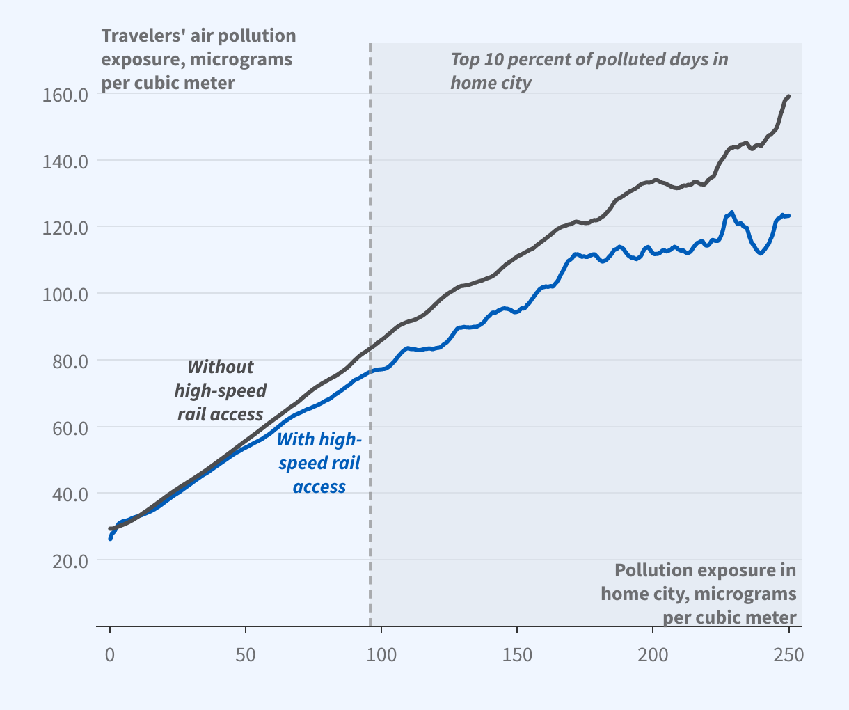
The graph is a scatterplot titled, “Travelers’ PM2.5 vs Pollution in Home City.”
The y-axis, which represents travelers’ air pollution exposure, measured in micrograms per cubic meter, ranges from 0 to 160, and the x-axis, which represents pollution exposure in the home city, measured in micrograms per cubic meter, spans 0 to 250.
Two series are plotted: one for cities with and one for cities without access to high-speed rail. Both series track closely for lower levels of pollution exposure in the home city. However, the series corresponding to cities without access to high speed rail is consistently higher than the other series for levels of home city pollution exposure above 100 (which constitute the top 10 percent of polluted days in the home city), and the gap widens as home city pollution increases.
Source: Researchers’ calculations using data from UnionPay, China’s Ministry of Ecology and Environment, NOAA’s Integrated Surface Database, and official government reports