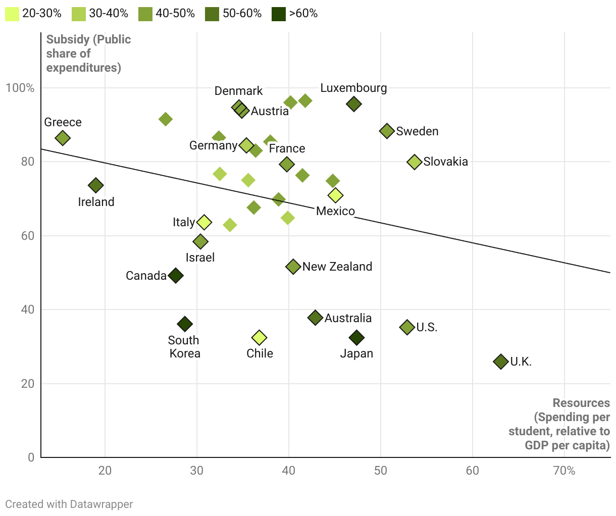
A scatter plot chart showing education resources on the x-axis and subsidies on the y-axis. Resources are calculated as a percentage. The value represents country spending on higher education divided by the number of full-time students, measured as a share of the country’s GDP per capita. Subsidies, also a percentage, are the public share of education expenditures. The scatterplot shows a negative trendline, indicating that universities that are in countries with higher government subsidies have fewer student resources and that those in countries with low government subsidies (that is, more private funding), have more student resources.
Subsidized universities don't always have better resources or attainment rates
Attainment rate: