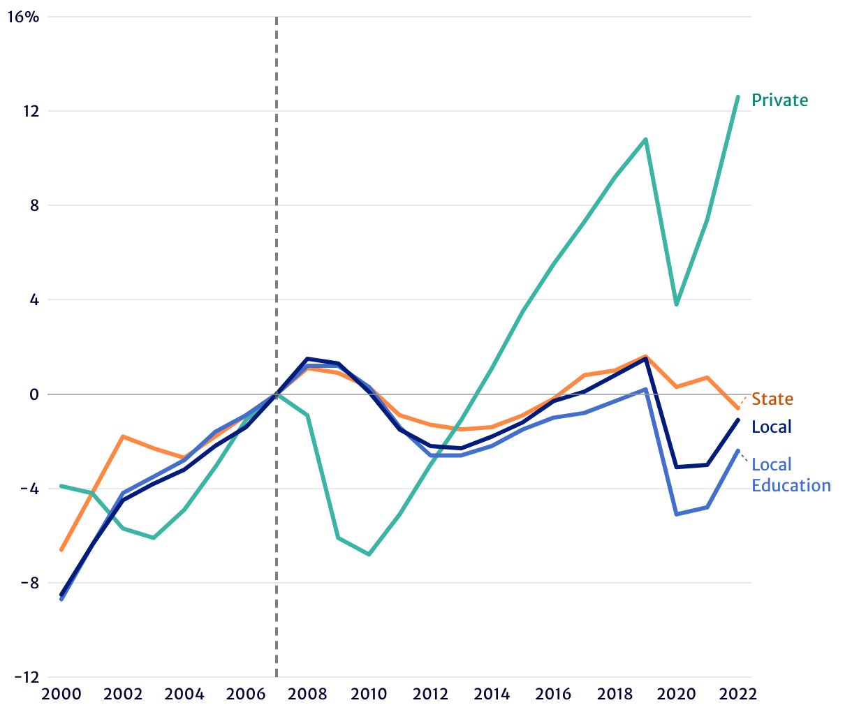
Public Sector Job Recovery Lagged Behind Private Sector Following Great Recession
This figure, Figure 2, shows the percent change in private sector employment (green line), state government employment (orange line), local government employment (navy blue line), and local education employment (lighter blue line) each year, centered around the year 2007. This allows us to compare employment levels to the peak year just prior to the Great Recession. The figure shows that while private sector employment largely recovered and resumed its growth, state and local government employment, including education employment as a subsector of local government, have grown much more sluggishly.
Source: Authors' analysis of Current Employment Statistics data, US Bureau of Labor Statistics, 2000-2022.