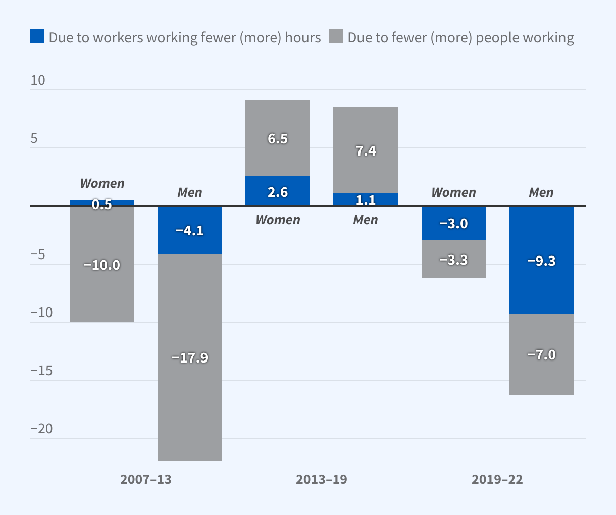
Annualized Change in Annual Hours Worked per Person
The figure is a grouped stacked bar chart titled, “Annualized Change in Annual Hours Worked per Person.”
The y-axis ranges from -20 to 10 hours, and each bar in the graph is decomposed into the portion of the change attributable to workers working fewer or more hours, as well as fewer or more people working. The change in hours is plotted for men and women for the following periods: 2007–13, 2007–13, 2007–13.
In the 2007–13 period, the annualized change in annual hours worked per female and per male was about -9.5 and -22, respectively, with fewer people working being the largest contributor to the declines.
In the 2013–19 period, the annualized change in annual hours worked per female and per male was about 9.1 and 8.5, respectively.
In the 2019–22 period, the annualized change in annual hours worked per female and per male was about -6.3 and -16.3, with workers working fewer hours being the largest contributor to the decline for men.