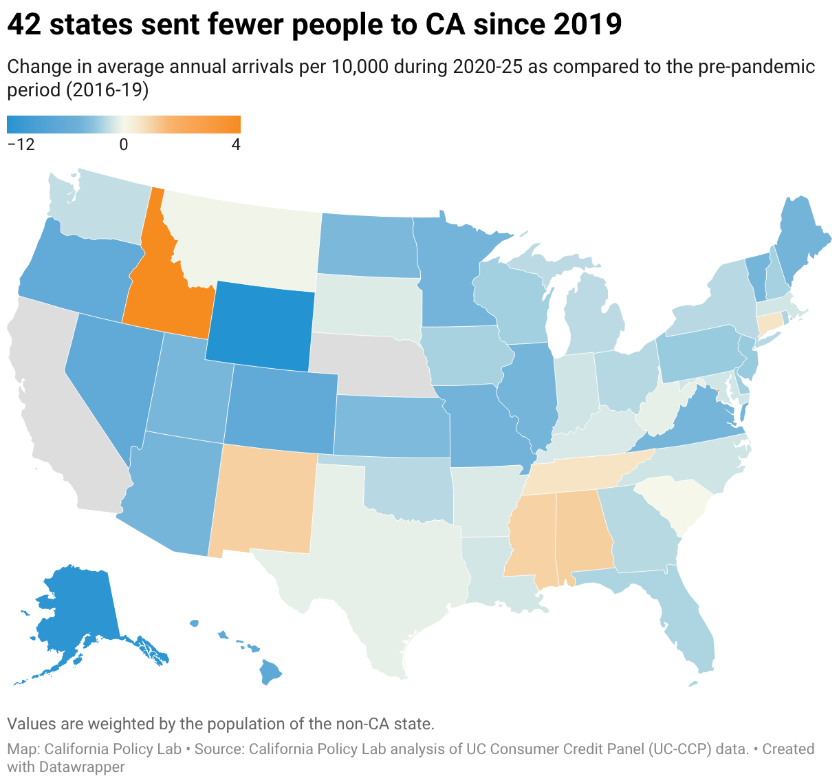
42 states sent fewer people to CA since 2019
Change in average annual arrivals per 10,000 during 2020-25 as compared to the pre-pandemic period (2016-19)
A choropleth map showing the change in annual arrivals per 10,000 residents to California during 2020-2025 compared to the pre-pandemic period. Most of the map is shaded blue, indicating that 42 states sent fewer people to California after 2019. Idaho is a notable exception, shaded orange, indicating an increase in people moving to California from that state.
