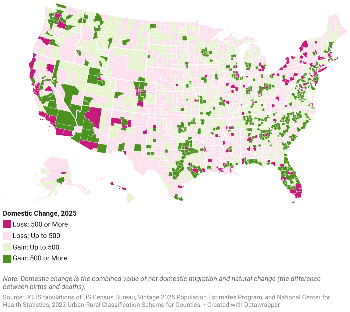
This county map shows domestic change—the combination of net domestic migration and natural change (births minus deaths)—across all US counties in 2025. It shows a consistent pattern around large metro areas, where urban core counties have steep losses from domestic change while surrounding suburban counties show strong gains. Regional patterns are also visible: much of the South shows positive domestic change, while losses are concentrated in parts of the Northeast, Midwest, and along the West Coast. Within the West, inland counties generally show gains while coastal counties show losses.
