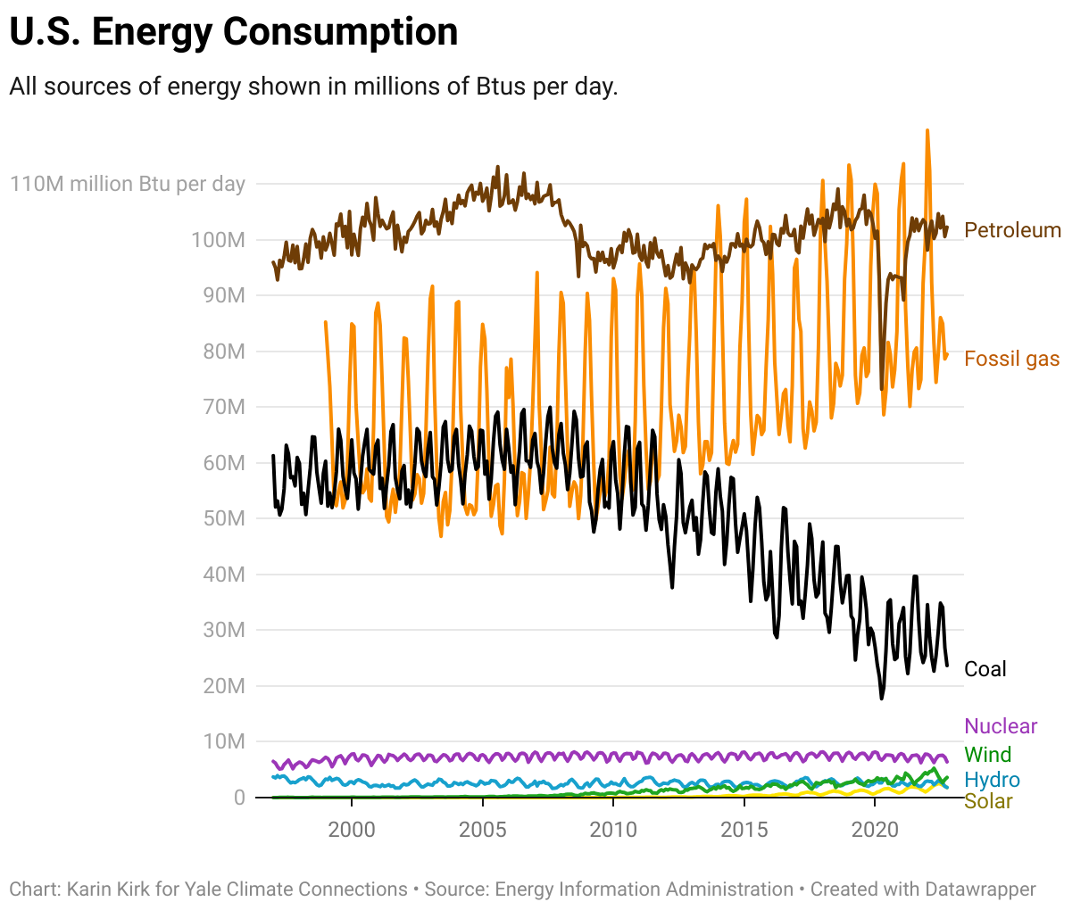
This chart shows 7 different sources of energy from 1997 through 2022. Each line shows how much of that source of energy has been consumed, and the data is plotted for every month.
Petroleum is the largest energy source consumed in the USA, on average. But fossil gas has a strong peak in the wintertime, and those peaks are larger than the amount of energy from petroleum. In other words, the gas peaks stick up above the steadier oil line.
Coal shows similar peaks as natural gas, but it declined significantly from 2011 through early 2020. Since early 2020, the amount of coal use has been steady. Note that this use is both from electricity generation as well as metallurgical coal which is used in heavy industry manufacturing.
Lower on the chart are the lines for nuclear energy, wind, hydropower, and solar, in that order.
U.S. Energy Consumption
All sources of energy shown in millions of Btus per day.
